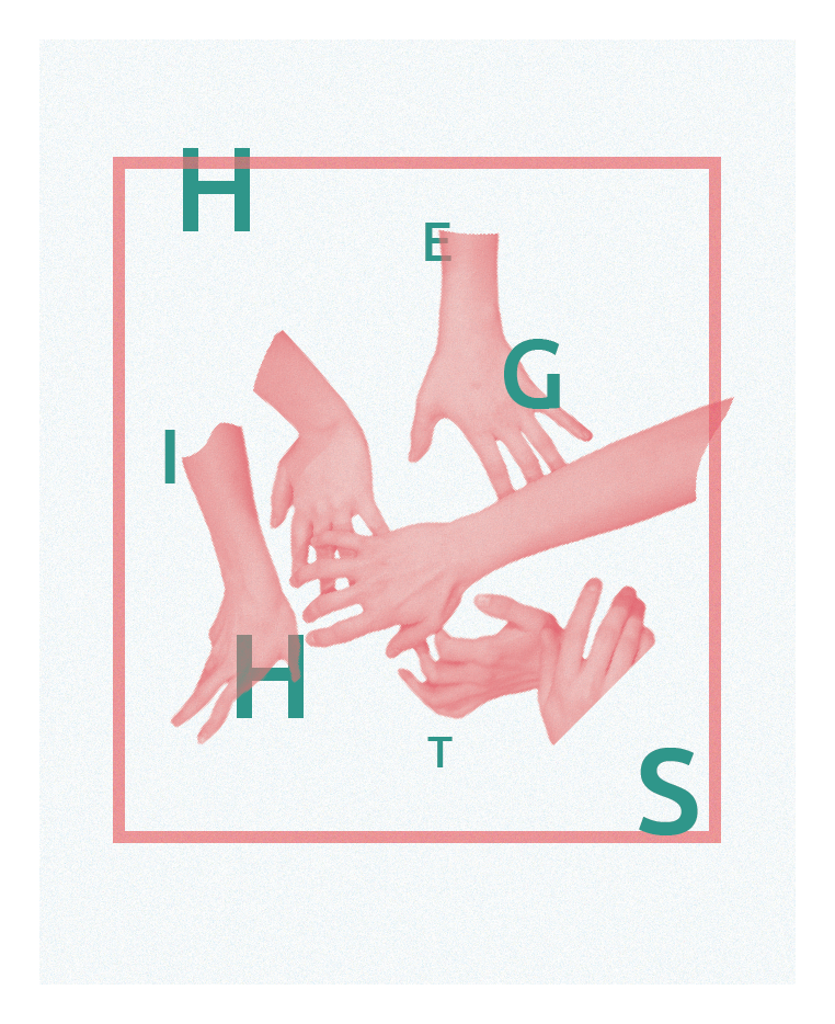
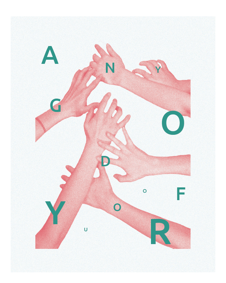
I began this project by using images I had in this Risograph style of graphic design. Below are a few of the first iterations that would not be included in the final posters but still offered inside in type-setting and photography.
After familiarizing myself with this style of graphic design I dove into the rest of the project by using images that I had gathered over the summer from vacations. I saw these images of my memories as small pieces of the summer and wanted them to sit very minimally on the page. I used negative space to draw focus to the foreground pieces of the images that I felt had stronger ties to my memories.
Here I also decided to go with a different color palette. The high contrast of the yellow and blue felt like it was closer to the feeling of summer I was trying to convey. The off white background and yellow really express the warm of these memories why the blue offers a chances for my memory fragments to stand out.
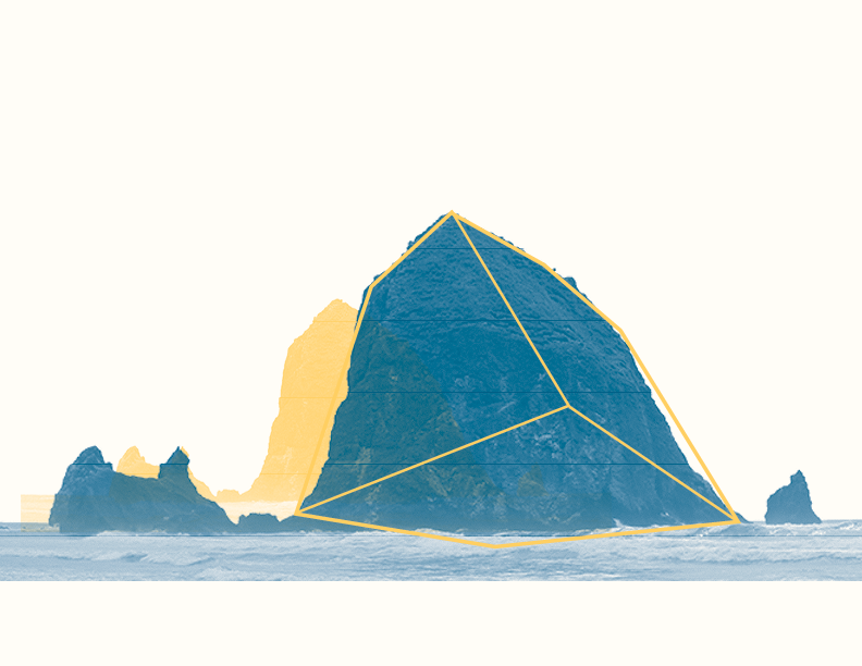
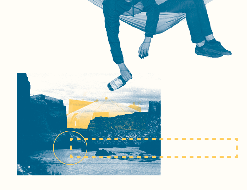
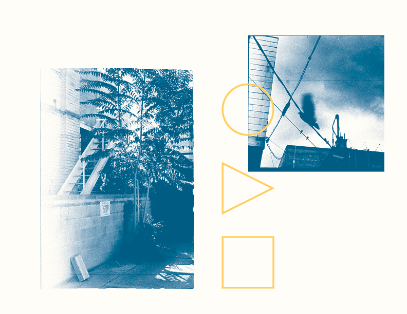
Photography allows me to look back and remember experiences I've had in a lovely way. I think where this project really stands out is the treatment and layout of the photographs. By separating some pieces of the photographs and combining them with other elements I was able to bring attention to the small details of my memories that meant more to me than just photograph alone.
These small pieces of focus are what really stood out to me from my travels over the summer. The specific focus points of memory. The Remnants.